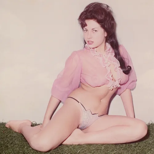
June Palmer

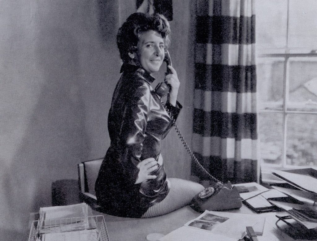
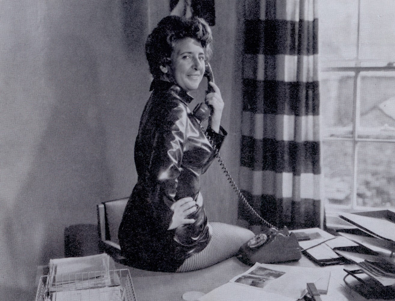
June Palmer 1960s Model

June was prolific, largely thanks to her association with George Harrison Marks, but she also appeared in many other publications and was still modelling professionally well into her forties for magazines such as Mayfair.
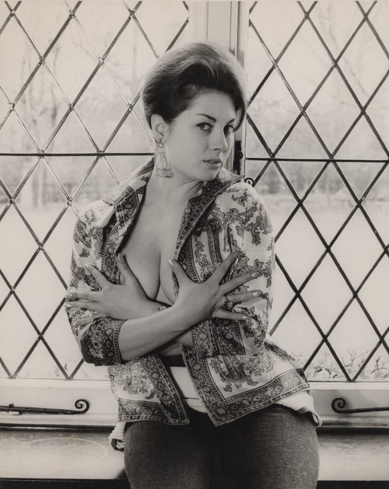
She was born June Margaret Palmer on 1 August 1940 in Bromley, Kent.

As is often the case, there are many contradictory stories about the details of her private life. Researching the past is full of possibilities and dead ends, and there will inevitably be differences of opinion. However, we can set the record straight on some points beyond any doubt.

We know from a copy of her marriage certificate that June was married on 7 November 1964 at the Chelsea Register Office, when she was a 24-year-old photographic model. The lucky man was 20 years her senior: 44-year-old photographer and stuntman Arthur Howell, a fascinating and charming man with an exciting and varied career. He was Michael Caine’s stand-in and a stuntman on several of the famous Bond films, and he was a familiar face on television, appearing in hit series such as Robin Hood and The Persuaders.


June and Arthur set up and ran Strobe Studios in Clapham, South London. It was a respectable business that hired out studio space to amateur and professional photographers alike, and supplied them with models from Strobe’s books, among them Mary Millington (under her married name, Mary Maxted).
June later divorced Arthur, who died three years after the divorce. In 1989 she married David C. Milan in Chelmsford, where she died suddenly in 2004.

June began her career as a topless dancer at the Windmill Theatre, where countless British starlets, actors and comedians cut their teeth. If that name means nothing to you, watch the film Mrs Henderson Presents, starring Judi Dench and Bob Hoskins.
She went on to appear in all of Harrison Marks’ magazines (Kamera, Solo and others) and in numerous 8mm glamour films made by him and others, before graduating to parts in mainstream films.
She was an extremely good-looking woman, and for me she looks her absolute best in some of the more candid, relaxed shots.
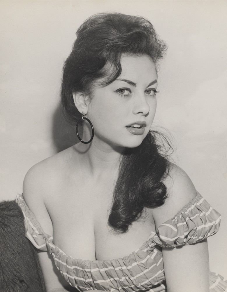

We have recently acquired a sizeable collection of prints and negatives of June, which we believe were taken by the little-known photographer Peter A. Quinn. Many may never have been seen before.

For more pictures and information on June Palmer, visit The Kamera Club and search for “June Palmer”, or go directly to her model page.
(Link to Print Sales)

(Link to Negative Sales)

1

Tied to the Times: Inside the House of Milan

A look back at one of the 1970s’ most prolific bondage publishers

Long before the internet made niche interests easy to find, fans of rope, leather and restraint relied on the mail. Plain brown envelopes, small-print order forms, and a handful of publishers willing to serve an audience the mainstream newsstands ignored. One of the busiest of those was the House of Milan Corp.

A founder who saw the gap

The company’s story starts with Barbara Behr. When she turned 21, old enough to legally buy bondage material, she found there was very little out there to buy. So she started making it herself, launching her own company just as attitudes toward adult publishing were beginning to loosen. Her timing was far kinder than that of the legendary John Willie, whose work arrived a decade too early to enjoy the same open market.

At its height, House of Milan was a genuine one-stop shop for the devotee: two separate lines of B&D magazines, two correspondence clubs, a mail-order division, short films, paperbacks and its own range of leather restraints.

The flagship magazines

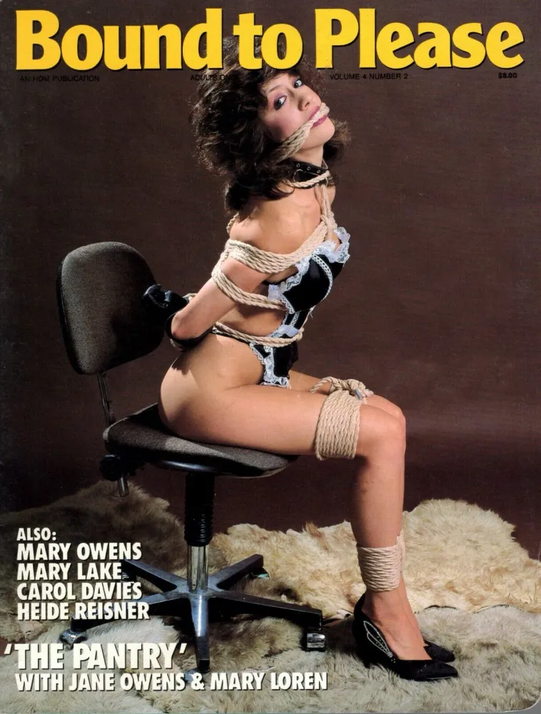
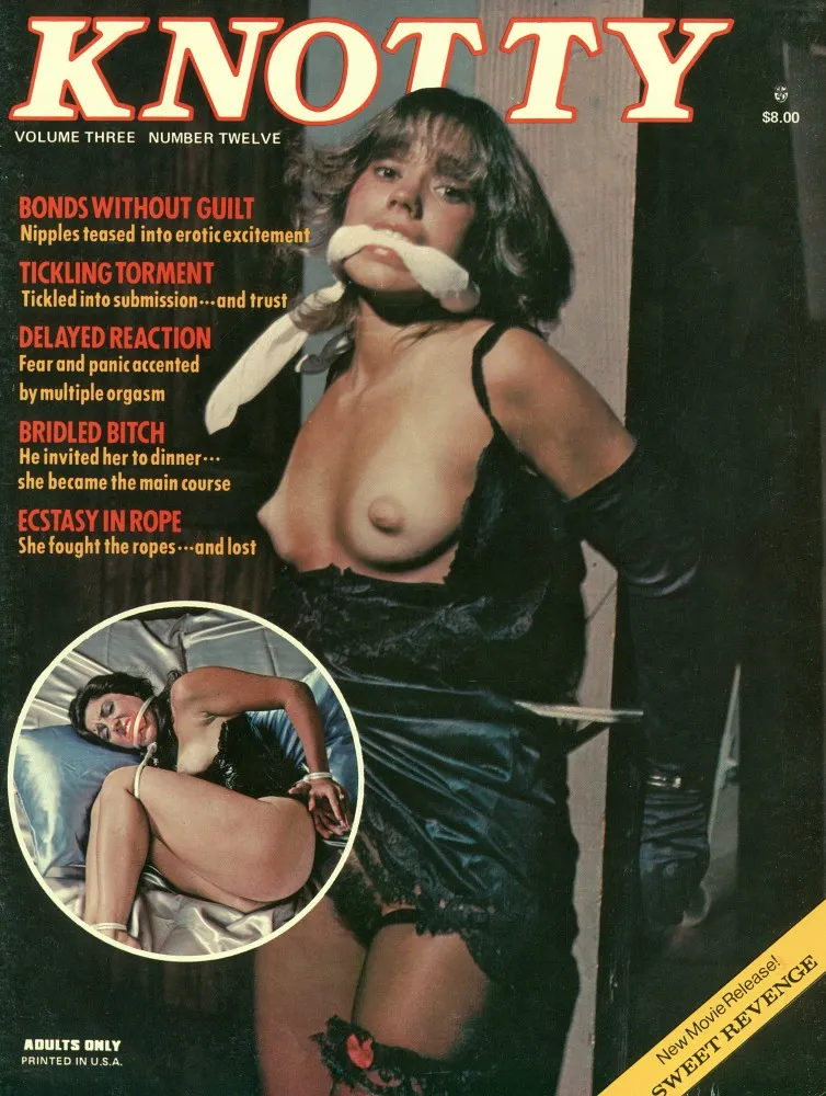
Behr’s first line, and her personal favourites, were HOGTIE, KNOTTY and BOUND TO PLEASE. They carried a consenting-adults ethos: alongside the photo sets came personal ads from readers, a lively letters page and regular artwork from the illustrator known as The Bishop. Custom leather garments, original restraint designs, nylons and heels all featured heavily.

A fourth title, NAKED BONDAGE, joined the line with a simpler pitch that did exactly what its name promised: solo and duo photo sets of gagged, roped and strapped models.

The Bishop and Fanni Hall

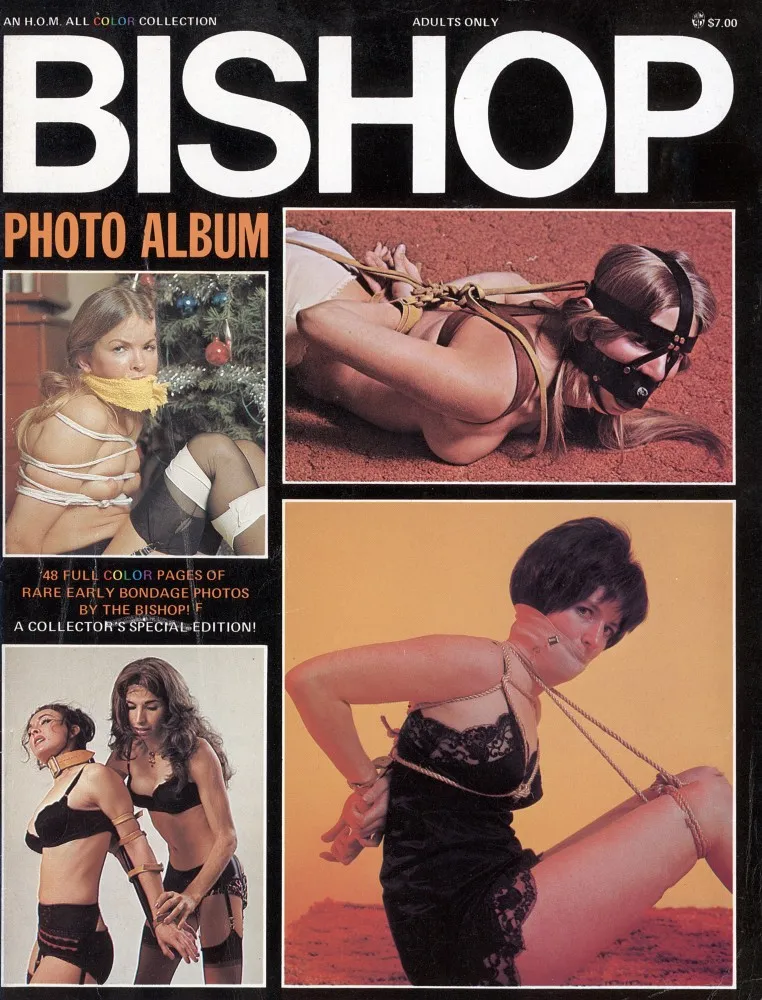
Illustrated fiction was central to the House of Milan identity, and The Bishop was its star. His comic heroine Fanni Hall first ran in KNOTTY before being spun out into her own releases:

  • BISHOP: The Complete Fanni Hall, collecting the KNOTTY strips.
  • BISHOP: Bunzie Gets a Surprise, a brand-new digest-sized story.
  • BISHOP: The Plot Thickens, a full magazine-sized continuation.

Paperbacks: F.E. Campbell and the Butler Fellowes

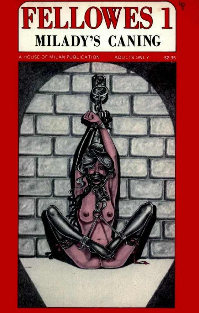
On the prose side, the company’s headline author was F.E. Campbell, with sixteen paperbacks in print and another sixteen in the pipeline. His novels explored captivity, cruelty and devotion to a dominant mistress. Perhaps the most charming format of all was the Butler Fellowes series: mini-paperbacks illustrated by newcomer Ashley, starring a butler who administers discipline with impeccable manners. Four were released early on, with eight more planned.

A rougher second line

In 1975 the company launched a second magazine line for readers who wanted something more intense: KIDNAPED!, BONDAGE CLASSICS, CAPTURED and WHIPMASTER. These moved away from the playful tone of the flagship titles toward staged “impromptu” scenarios, more strenuous positions, tighter rope work and suspension. Short films such as Attacked (No. 110) and Interrogation (No. 112) followed the same approach.

Clubs, leather and mail order

House of Milan also ran two correspondence clubs: Aggressive Women, featuring only dominant ladies, and Latent Image, which catered more to submissives. Both worked as ad-driven contact magazines at a time when that was one of the few ways like-minded people could find each other.

The leather line came about almost by accident. Behr couldn’t find restraints good enough for her own shoots, so she had her own made. The result was a range of heavy-duty gear with quality hardware and a real emphasis on safe design. Its best seller, nicknamed the “Play and Breathe Too”, was a shoulder harness with cuffs at the back that held the arms behind the wearer without anything running up to the collar, a smart fix for a common and risky setup.

Rounding everything out was a mail-order division stocking B&D titles from major US and European publishers at discount prices. Customers simply wrote in for the free brochures and, naturally, stated their age.
Why it matters

House of Milan is a perfect example of how the 1970s fetish press really worked: small, founder-driven, and built as much on community (letters, contact ads, clubs) as on content. Behr’s operation spanned photography, comics, pulp fiction, film and gear, and the fact that she started it because she couldn’t find what she wanted says a great deal about the scene at the time.

Bondage – BDSM

2

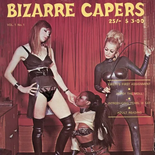
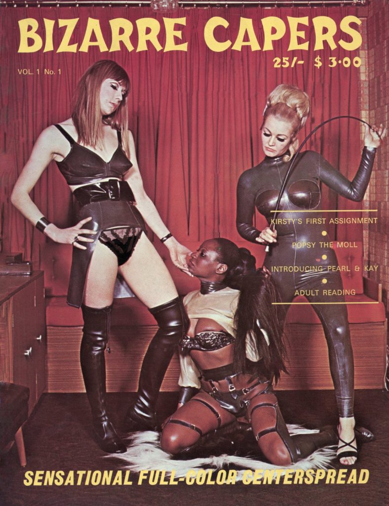
Bizarre Capers, Vol. 1 No. 1: Leather, Latex and a Missing Microfilm

Bizarre Capers 1960s Fetish

A debut issue from 1960s Britain that’s part spy thriller, part catfight and part rubber-and-leather fashion shoot. All of it is played completely straight, which is exactly why it’s so much fun.

The publisher

Bizarre Capers was published by Pictorial Productions Haverhill, Suffolk, and distributed by Ben’s Books Ltd., which traded from the Covered Market at 24b Crown Street in Acton, London W3. The masthead credits Bridget du Barry as editor, Basil Ryness as photographer and Ken Smith as art editor. The cover price of 25/- (with $3.00 for the American market). The beehives, PVC macs and wallpaper put it firmly in the late 1960s.
Ben’s Books seems to have been the commercial engine behind the title. The magazine includes a full-page list of “unusual books” available by post from the Acton address, with titles such as The Cult of Pain, Sexual Fetishism, Spanking and Chastisement, all priced in shillings and pence. There is also a subscription form offering six bi-monthly issues for £9-0-0.

The story: “The Madam ‘X’ Caper”

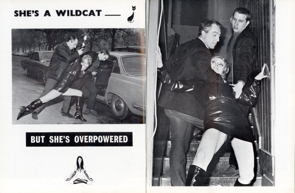
The issue is a single photo-story told across 30-odd pages with short captions and pulp-comic speech bubbles (“OOPS!”, “TAKE THAT!!!”, “This doll is a real wild one!!!”). The plot is pure Swinging-London B-movie. Professor Lindell has invented “a revolutionary new sex drug” and hides the formula on microfilm. He hands it to Kirsty, the International Courier Service’s “most experienced courier” and a “typical Swedish beauty”, who is helpfully introduced with her vital statistics. The notorious Madam ‘X’ wants the film, and she sends two heavies, Len and Charlie, to get it.

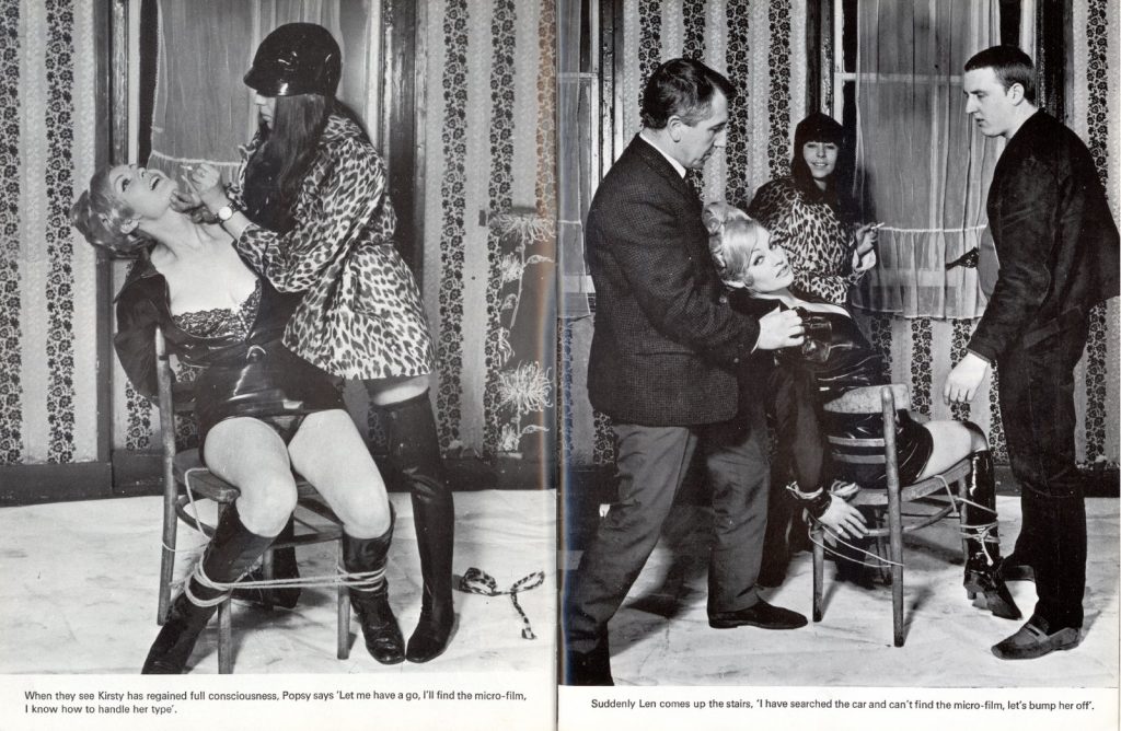
Kirsty kicks, judo-throws and flips her way through the opening pages (“Kirsty didn’t take judo and karate lessons for fun”). She is eventually dragged to a first-floor hideout, tied to a chair and interrogated by Popsy, the gang’s moll, who wears a leopard-print coat and a motorcycle helmet. The search for the microfilm is a pretext for undressing her one layer at a time, and the bondage and domination angle comes through clearly in these pages.

Pearl & Kay, and the rubber

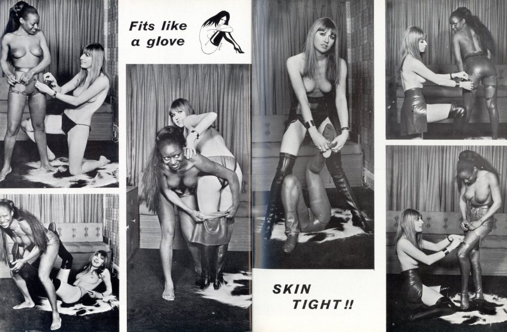
The second half is where the fashion fetishism takes over. Pearl and Kay are left to guard the microfilm, and they spend a long and lovingly photographed sequence helping each other into Madam ‘X’s wardrobe. It includes thigh-high boots, strapped leather leggings, corsetry and a rubber bodice. The captions are as subtle as you’d expect: “Fits like a glove”, “SKIN TIGHT!!”, “…try my gear for size”. Fans of 1960s rubberwear and strap-and-buckle leather will find a lot to enjoy here, because the outfits are shot full-length and often in detail.

Kirsty then makes her entrance in a borrowed leopard-skin coat, and a three-way brawl spills across the sofa and sheepskin rug. Riding crops come out, and in the end everybody but our heroine is laid out on the carpet. “Ah! The microfilm is safe.” A full-page teaser promises “Kirsty’s exploits next month … even more breathtaking.”

The colour centrespread

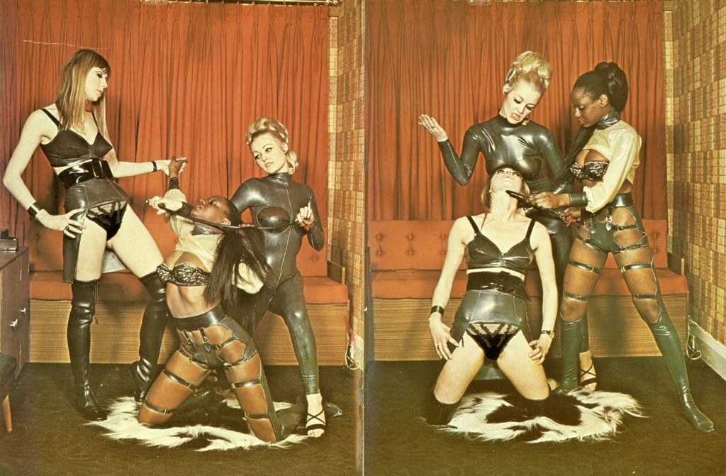
The centrespread is the only colour inside the magazine, and it reprises the cover set-up in rich saturated tones. Madam ‘X’ appears in a sheer rubber catsuit, Kay in a leather corselette and thigh boots, and Pearl in a full strap harness, all posed on a white sheepskin against a red curtain. It’s dominance theatre staged with complete sincerity.

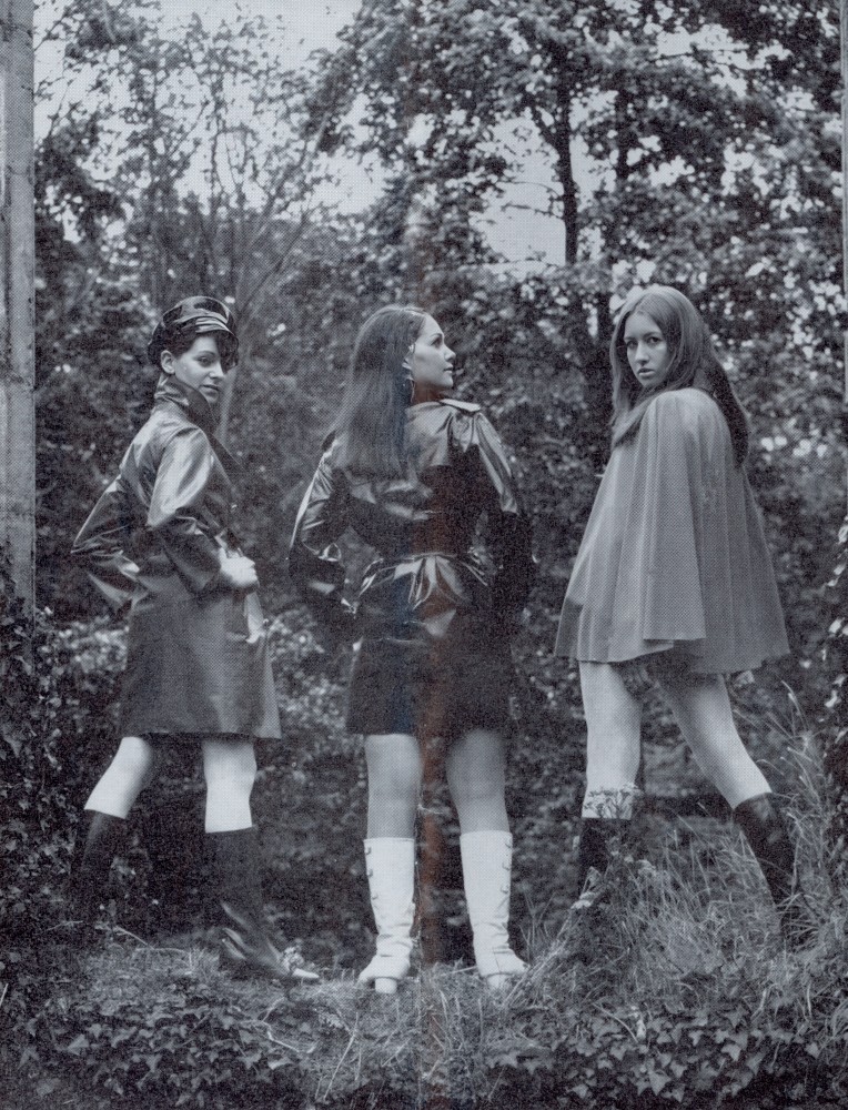
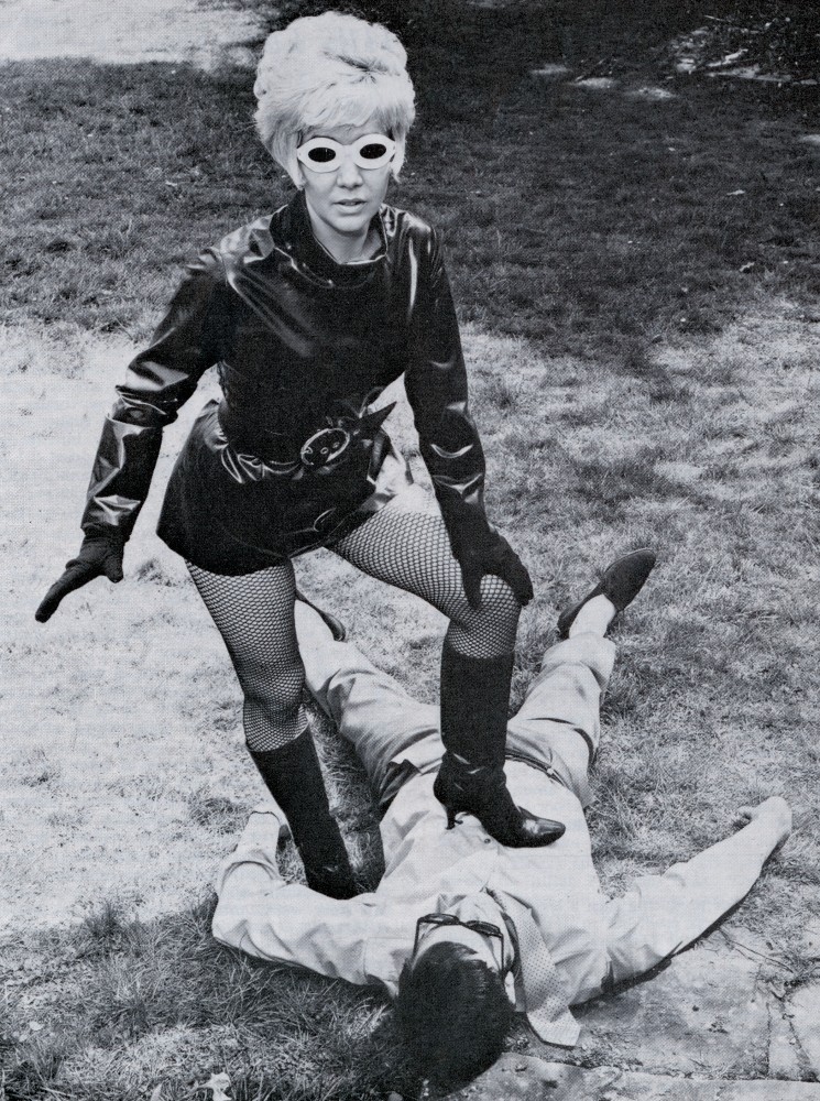
As a period piece, Bizarre Capers No. 1 shows the British fetish under-the-counter trade before it became self-aware. The production values are surprisingly good, and the outdoor action photography is genuinely dynamic. The whole thing is held together by a plot that wouldn’t have been out of place in an episode of The Avengers if Emma Peel had a less forgiving wardrobe department. It’s essential for collectors of British bizarre magazines and an easy recommendation for anyone who loves vintage leather, rubber and a good old-fashioned catfight.

Bizarre Capers – For Sale

1

Rain and Rainwear Review

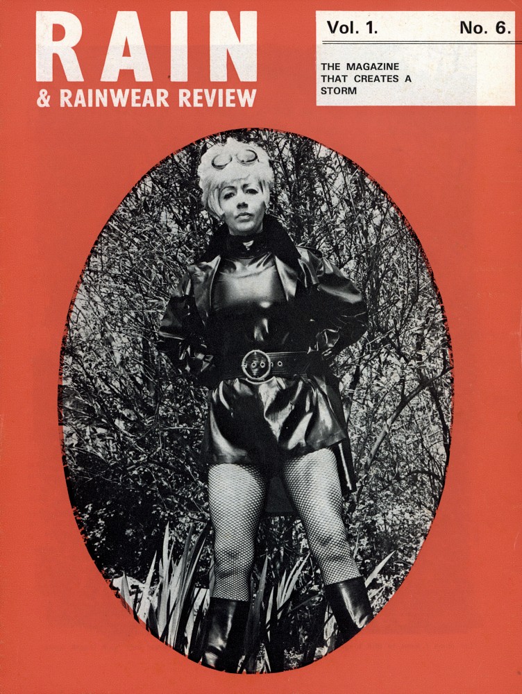
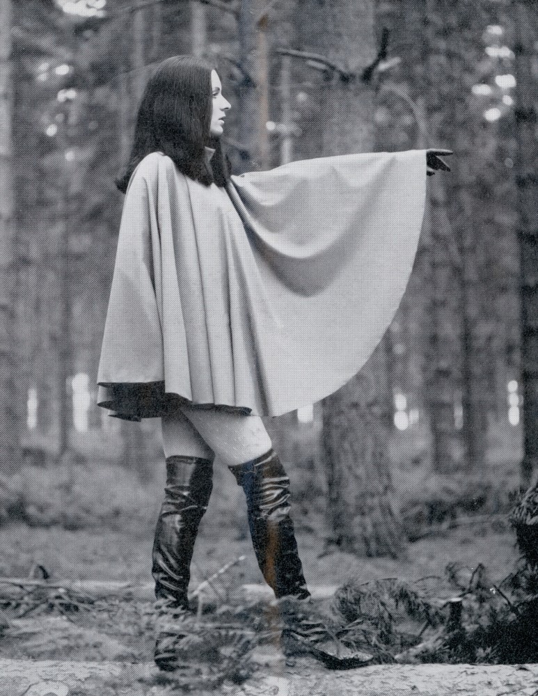
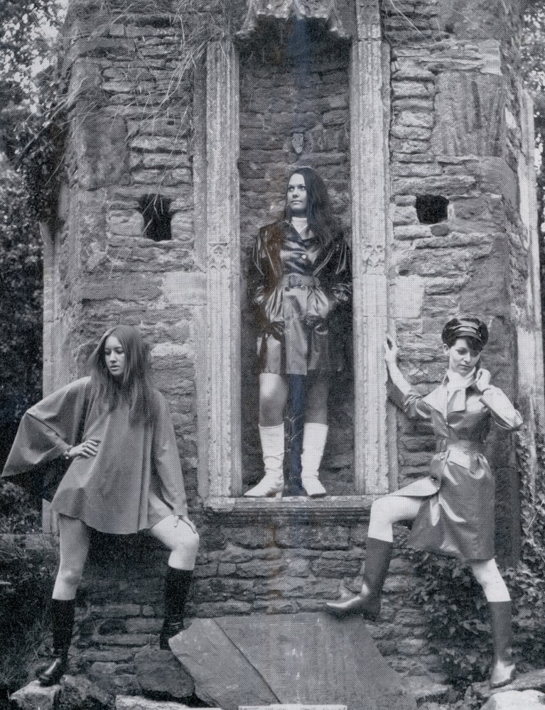
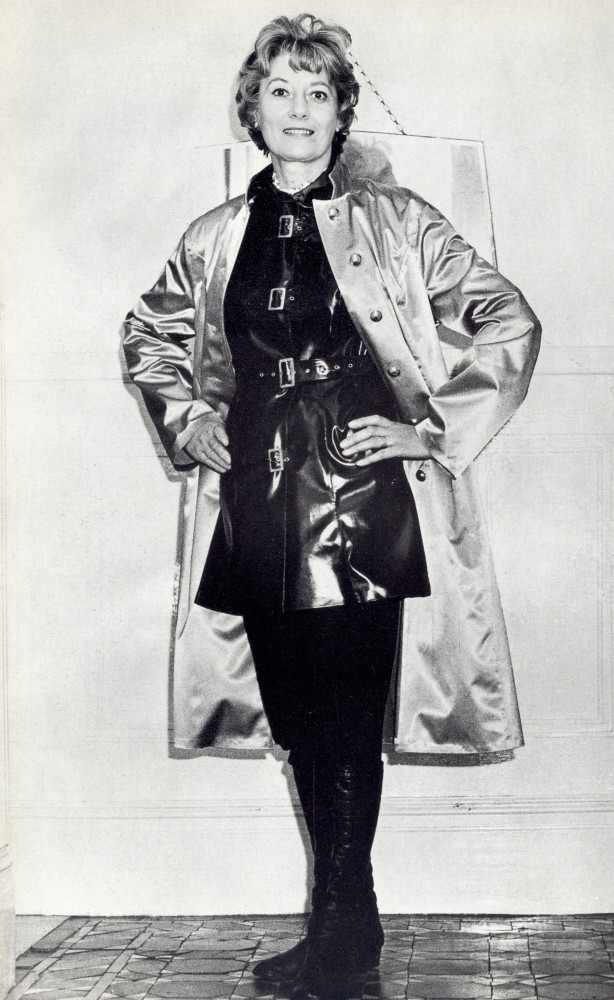
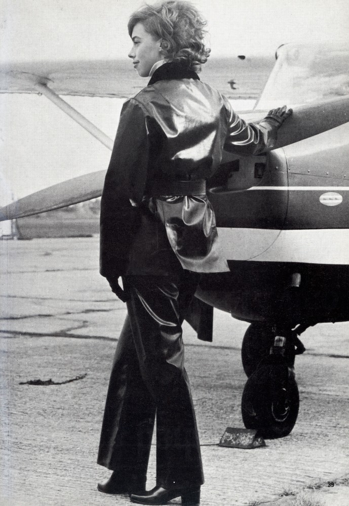
Rain and Rainwear Review Mackintosh Magazine 1960s

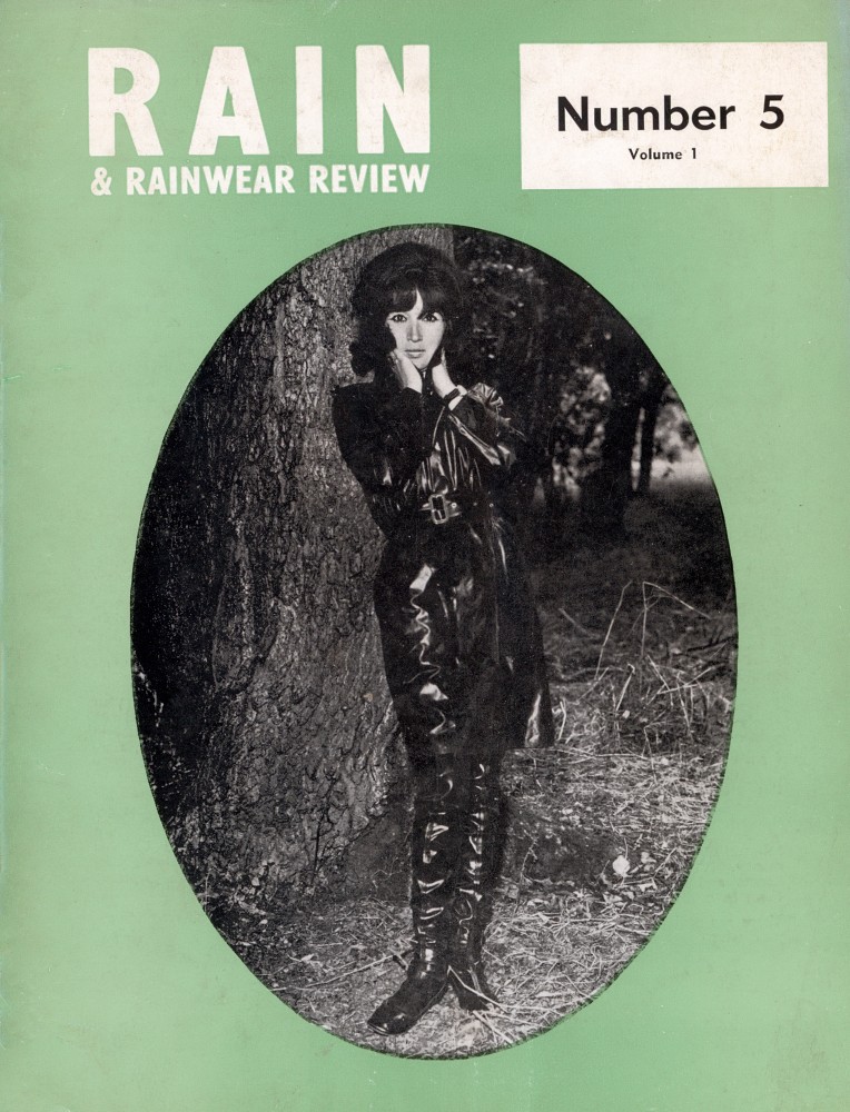
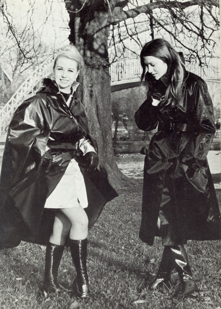
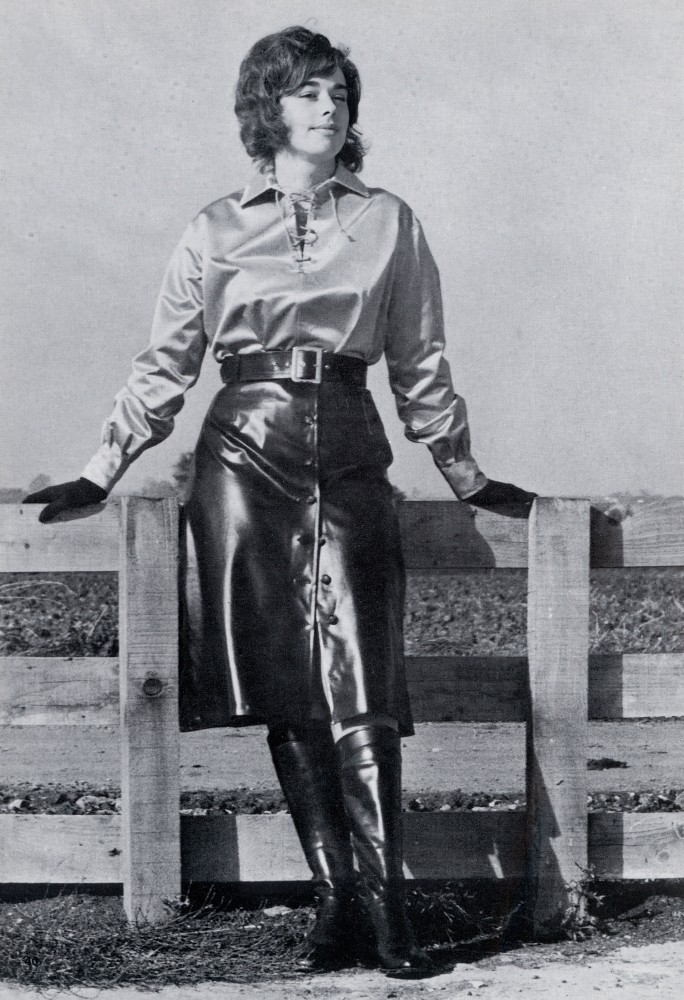
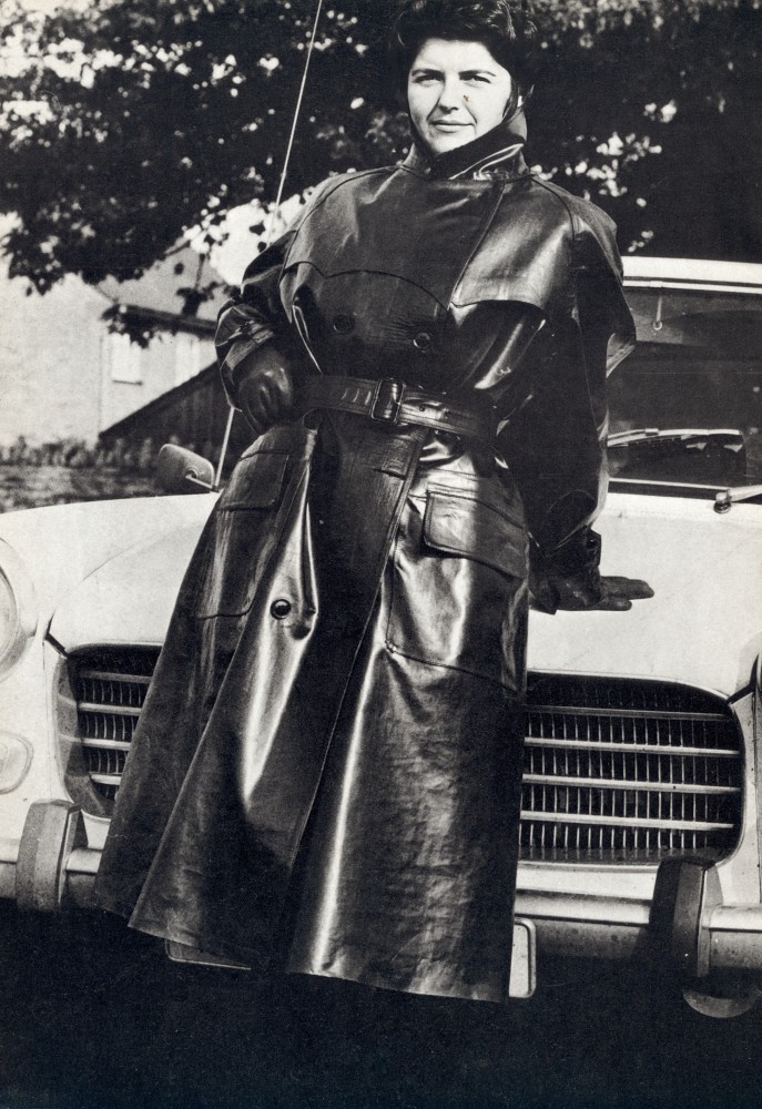
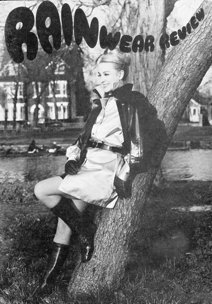
Rain and Rainwear Review: Mackintosh Fetish Magazines from the 1960s and 1970s

Having only a few copies of each title, I became curious about their origins and decided to research them further. Sadly, very little documented information appears to survive. The information below has therefore been compiled largely from evidence contained within the magazines themselves, helped along by AI in connecting the dots, but ultimately presented here in my own words.

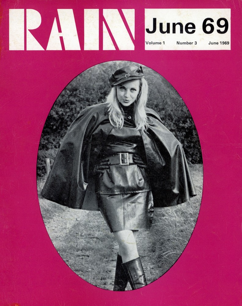
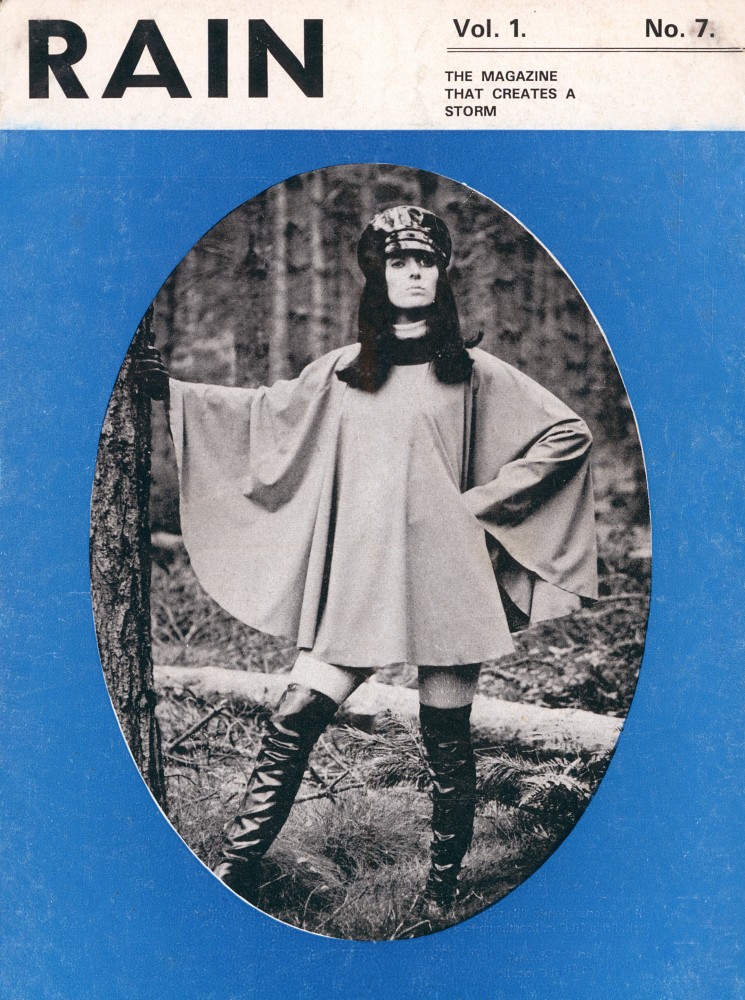
Rain: 1968 to 1970
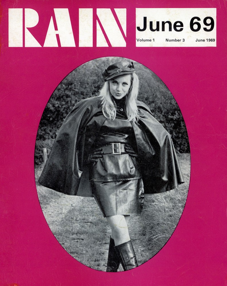
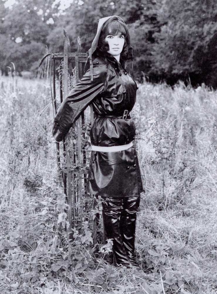
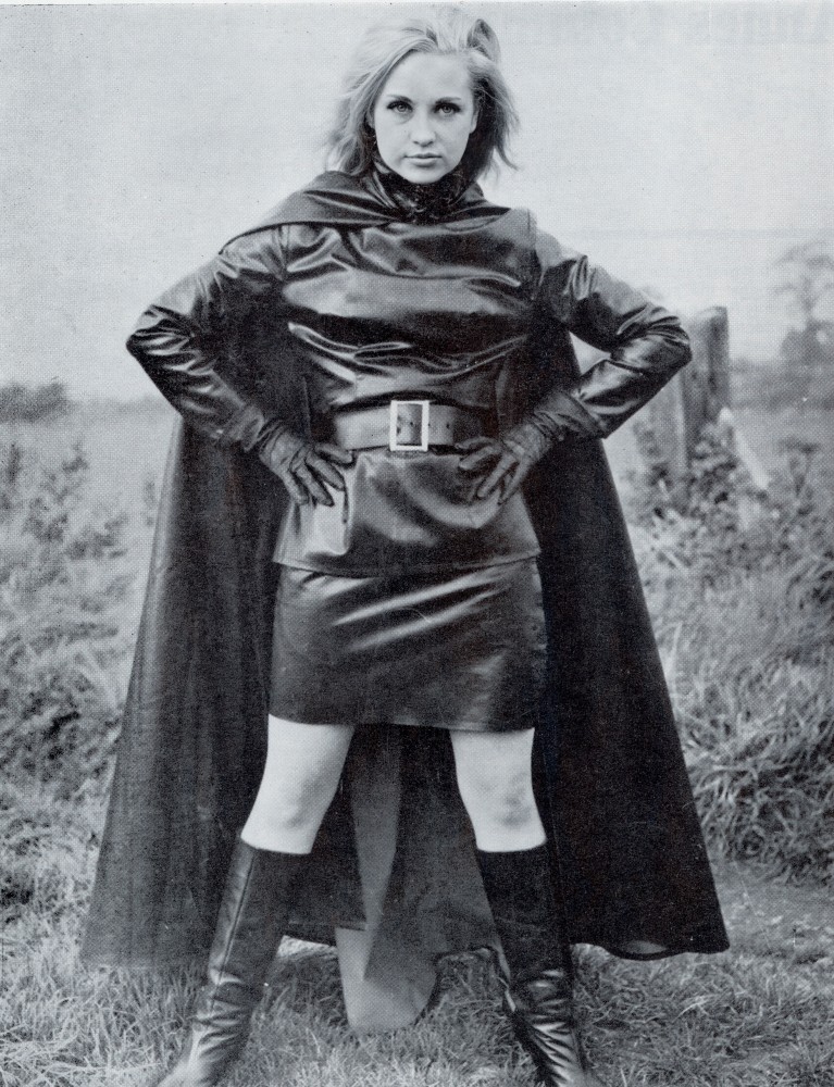
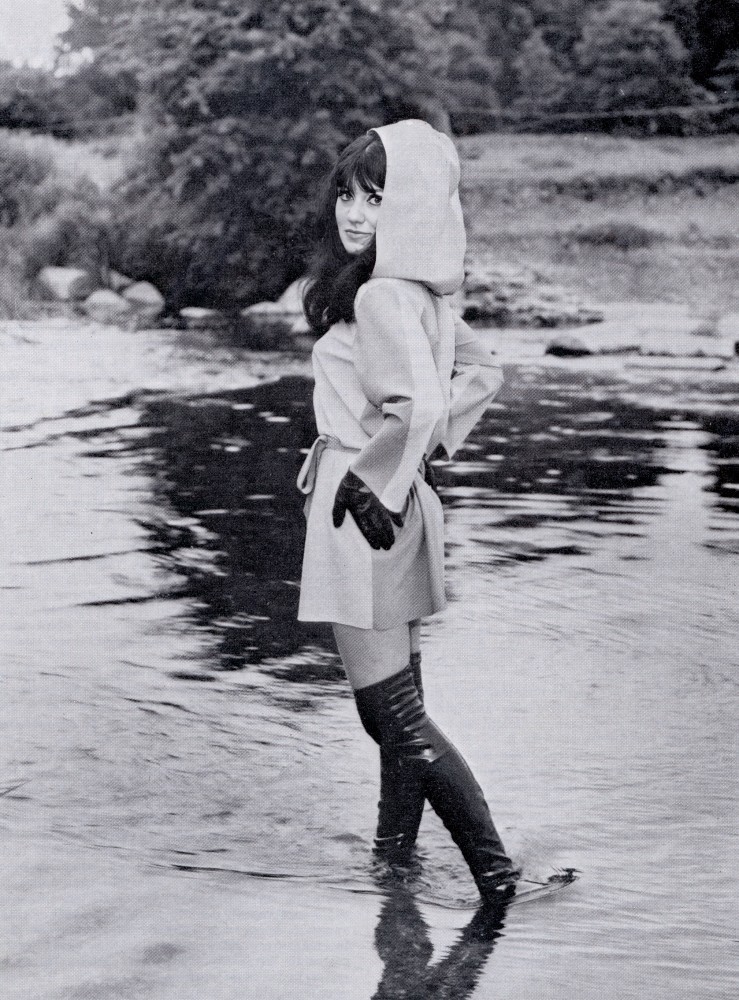
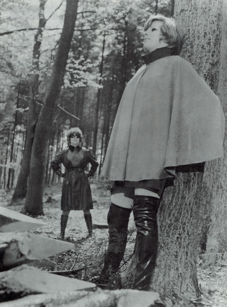
Rain was launched sometime towards the end of 1968 and was published by Ray and Veda Campbell. The Campbells were enthusiastic promoters of mackintosh fashion. Rather than concentrating on the practicalities of rainwear, they emphasised style, photography, and the social side of the fetish. Their aim was to present mackintoshes as fashionable, attractive, and fun to wear. They actively encouraged reader participation through articles and photographs submitted by readers. It also attempted to bring members together at social events, although how successful this was remains unclear.

The Vedamac Connection
An interesting aspect of Rain is its association with Vedamac.
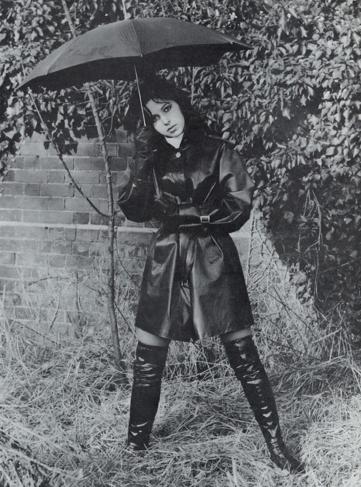
The magazine openly promoted a range of shiny mackintoshes marketed under the Vedamac label and gave a contact address at 5 Castilian Terrace, Northampton. The editorial states that the publishers were actively involved in the development and sale of these garments, suggesting a close relationship between the magazine and the fetish rainwear business itself.
It would not be too much of a leap to suppose that “Vedamac” was derived from “Veda” and “Mac”, reflecting Veda Campbell’s involvement. 

The Emergence of Rainwear Review
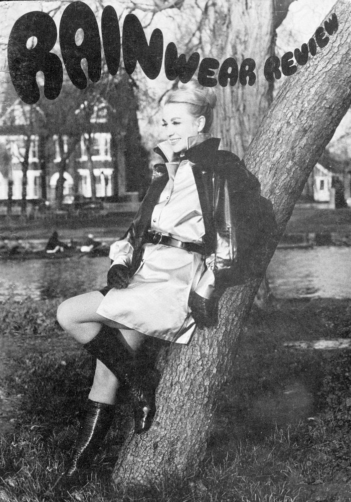
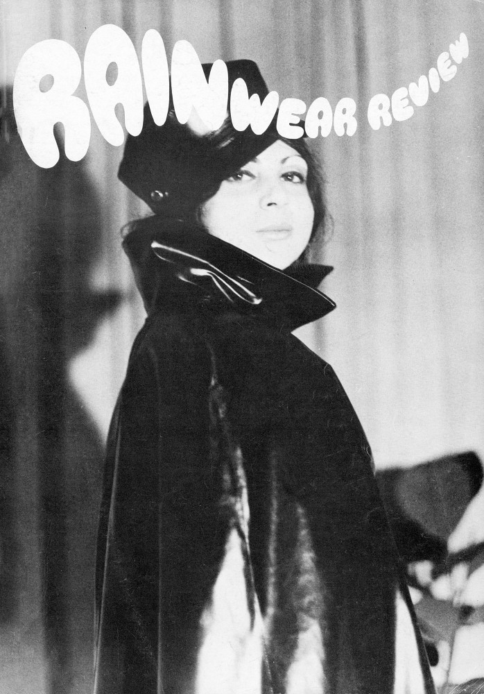
Rainwear Review appears to have been a rip-off of Rain that first appeared around 1970 and was also available only by subscription.
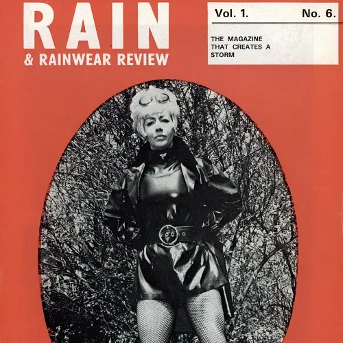
In Rain Vol. 1 No. 6, Veda Campbell alleged that another publisher had copied the concept of Rain and adopted a confusingly similar title. According to Campbell, the dispute became serious enough to involve legal advisers, with the rival publisher ultimately forming a limited company, Rainwear Review Ltd., in order to continue using the name Rainwear Review. Campbell was keen to stress that Rain had no connection whatsoever with the new publication.
The following issue reinforced this claim. Rain Vol. 1 No. 7 carried the slogan “The Magazine that Leads – the others follow”, which may be interpreted as a further reference to the rivalry between the two publications. The same issue continued to identify Ray and Veda Campbell as publishers and promoted Vedamac products from their Northampton address.
These editorials indicate that Rainwear Review was not originally a straightforward continuation of Rain. Instead, the evidence suggests that the two magazines were separate publications and, at least for a period, direct competitors. 

The Final Chapter
Issue No. 11 of Rainwear Review, published in March 1972, was the last issue. In a moving editorial signed “J.G.W.W.”, he explains that he is writing from the Royal Marsden Hospital and has been told he has only a short time to live. He announces that the issue will be the magazine’s last.
Remarkably, the same editorial notes that demand for the publication had become so strong that the print run had been increased to 750 copies, a substantial number for such a specialised title. It also helps explain why these magazines are so difficult to find today. Seven hundred and fifty copies of each issue is not a large number to be distributed worldwide, and I would guess that the print runs of Rain were even smaller.
The editorial also mentions that while the magazine was closing, the related business Trudimac would continue trading, something I need to look into further, as we can again assume that the name was associated with Trudi Warne.

Why These Magazines Matter
Today, original copies of Rain and Rainwear Review are far more than simply old fetish magazines. They represent an important chapter in the history of British mackintosh culture and provide a unique record of a specialised enthusiast community that flourished during the late 1960s and early 1970s.
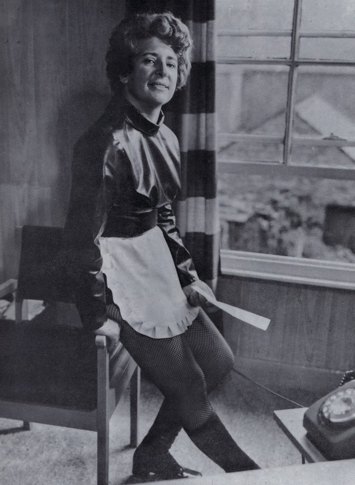
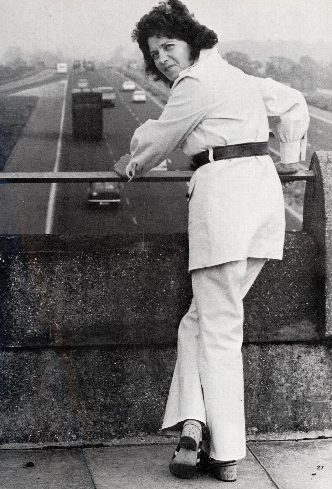
The magazines contain fashion photography, editorials, advertisements, society news, readers’ contributions, and material relating to companies such as Vedamac and Trudimac. Many issues were produced in modest quantities and were distributed primarily through subscriptions, making surviving examples increasingly difficult to locate.
For collectors, complete runs are exceptionally scarce, while even single issues provide valuable insights into rubber fetishism.
As surviving copies become harder to find, these magazines continue to grow in importance as historical documents and as highly desirable collectibles for anyone interested in fetish rainwear, specialist publishing, or the enduring appeal of the classic rubber mackintosh.

I have produced high-quality scans of the copies I own and made them available as downloadable files at a minimal cost. The original copies have also been listed for sale and can be found here.

If anyone has copies of either of these titles, then I would be interested in purchasing them or scanning them for others to enjoy. Please do contact me.

1

Wet and Messy – Splosh!

Wet & Messy – Splosh! Magazine and the Birth of a Subculture

Splosh! holds a unique place in the history of British adult publishing. First released in 1989 and created by Clive Harris (better known under his pseudonym Bill Shipton), it became the defining magazine for Wet and Messy Fetishism (WAM). The publication featured playful photo sets and stories of models getting wet or messy with food, water, slime, pies and other harmless, tactile substances. It was light‑hearted, cheeky, and visually distinctive — and it was the first magazine to bring this niche out into the open.

Over its 40‑issue run, Splosh! grew into a full production house, releasing VHS and DVD videos and later expanding online. At its peak in the 1990s, the magazine had thousands of subscribers worldwide and was stocked in mainstream UK bookstores, making it one of the most visible fetish publications of its era. Many of its models went on to appear in video sketches and digital downloads as the scene evolved.

The WAM community itself is built around the sensory appeal of textures, colours and the visual fun of getting messy — often fully clothed, sometimes not, but always centred on harmless materials like custard, cream, mud or gunge. While the wider scene has since moved online, original print issues of Splosh! and similar titles have become highly collectible pieces of fetish history.

Wet and Messy – Sales Category

1

Utopian Press – Fads and Fancies

Fads and Fancies - Utopian Press

Utopian Press & Fads and Fancies: A Peek Into Bristish Mid‑Century Fetish Publishing

For collectors of vintage erotica, glamour magazines, and mid‑century curiosities, few names spark as much interest as Utopian Press. What began as a modest science‑fiction pamphlet publisher under the direction of Benson Herbert soon evolved into one of the most inventive — and mischievous — operations in post‑war British print culture.
Herbert, already an experienced publisher, clearly had an eye for the risqué. Even his early sci‑fi covers leaned toward pin‑up styling, hinting at the direction he would eventually take. By the late 1940s he had abandoned science fiction entirely, turning his attention to producing saucy, light‑hearted magazines at a time when British publishing laws made such ventures nearly impossible.
New periodicals were prohibited, so Herbert simply refused to publish a “periodical.” Instead, he released each monthly issue under a completely different title — a clever loophole that produced a parade of wonderfully named one‑offs: Carnival Capers, Sporty Stories, Blue Stories, Haywire, Snap, Cuban Capers, Hubba Hubba, Heebee Jeebee, and more. Each stood alone, yet together they formed a distinctive body of work that collectors now treasure.

The Birth of Fads and Fancies

Among Herbert’s creations, one title rose above the rest: Fads and Fancies.
It began quietly in January 1950 as a supplement inside Sporty Stories, then appeared in several other monthlies before being published independently in June 1950. The numbering was eccentric — the first standalone issue was labelled Volume 1 No. 6 — but this only adds to its charm today.
What truly set Fads and Fancies apart was its artwork. The magazine was lavishly illustrated by Reina M. Bull, signing as RMB and, within this series, as Janine. Her drawings of women in stockings, corsets, bloomers, hats, heels, lace, bows, and ruffles created a theatrical, highly adorned femininity that remains instantly recognisable. Her style is playful, elegant, and unmistakably mid‑century.
The written content came almost entirely from readers. Letter after letter — numbered for reference — explored the fashions, fascinations, and personal preferences of the era. Topics ranged from underwear and hosiery to skirts, jewellery, cosmetics, hobble skirts, garters, and even horses. It’s a vivid snapshot of post‑war British interests, expressed with a mixture of enthusiasm, humour, and discretion.

A Glimpse Into the Editorial Voice

A charming start to it all is Benson Herbert’s editorial introduction. In it, he welcomes readers to the first full issue, explains the mix of art paper, and gently reminds contributors that censorship rules sometimes forced him to alter or omit letters.
He notes, with a wink, that the magazine contains “nothing professional at all” — everything was written by readers themselves. It’s a rare moment of transparency and warmth from a publisher navigating a maze of restrictions while still trying to give his audience something fresh, playful, and personal.

Why Collectors Love These Today

Original Utopian Press titles are now increasingly rare. Their scarcity, combined with their quirky publishing history, distinctive artwork, and candid reader‑driven content, makes them highly desirable for collectors of vintage erotica and mid‑century print culture.
Each surviving copy is more than a magazine; it’s a small, rebellious piece of British publishing history.

Utopian Press – Fads and Fancies – Sales Category

1

Soho Typescripts and Handmade Publications

Soho Typescripts and Handmade Publications

I recently acquired a small collection of Soho typescripts and handmade publications from a private collection. Their content is dubious to say the least.

Soho typescripts from the 1950s and 60s. They were typically typewritten and then stencil-duplicated before being stapled into card covers.

These books were sold from the back rooms of Soho bookshops and under the counter by other second-hand dealers. They were popular and expensive at the time, but few remain today. Content typically consisted of two or three pornographic stories, often accompanied by drawings and photographs that were frequently unrelated to the narrative.

Content was very varied, with some of it being very questionable indeed. Popular topics included teenage sex, flagellation, lesbianism, femdom, and straight sex, but often at the extreme end of what might have been considered socially acceptable at the time, with a great deal of it definitely not acceptable in today’s world.

Most of these have now long disappeared into dark cupboards or have just been destroyed, and so are now very collectible. Some research on their origins and content has been done from a social history point of view. If you are interested in digging deeper, then check out the links below.

The Secret Porn of Post War London – The Soho Bibles.

Taylor & Francis – Porn Studies, available online here.

2

Harmony Communications 

Bondage Life - Harmony Communications

The Bondage Company.

Monthly magazines, films, and video cassettes featuring fully dressed, semidressed, or fully undressed ladies in tight, scrumptious “Love Bondage.” For the truly finicky, there are whole photo sections of bathing cap bondage, tennis shoe bondage, cheerleader bondage, and all the other bondage fantasies Harmony has managed to hear about and then portray.

To keep customers apprised of what’s old and new in the Harmony inventory, a free, lavishly illustrated catalogue sheet is sent out like clockwork each month to the company’s mail-order buyers. 

Since 1976, Harmony has been earning the approval of bondage lovers by not only producing its own contemporary materials, but also reprising the classic “Damsels in Distress” photo collections of pioneer bondage producers Irving Klaw and John Willie. Harmony has also published full magazine retrospectives of the complete photo collections of such celebrated mail-order bondage stars as Lyndia, Cheryl Rothman, Sally Roberts, Joanne Link, Judith Wilson, and others.

Most of Harmony’s magazines, films, and videocassettes are devoted to pictures of pretty women tied up and gagged in either their underwear or various bondage costumery, although there is also a generous quantity of fully nude bondage magazines in the Harmony output. Whatever the visual content, Harmony avoids offering anything that smacks either of violence or tastelessness, doting instead on its soft “Love Bondage” theme in which the Bound Beauty is characterised as an accomplice with her lover in a mutual act of pleasant foreplay. With Harmony, the pretty lady is all tied up because she wants to be.

One of Harmony’s accessory materials are the storyline videocassettes from Arrow, which star Sally Roberts and Susan Blair. So far, Harmony has been releasing one of these hour-long videocassette programmes each month.

If bondage is one of your pleasures, you should request being placed on Harmony’s monthly mailing list (you must send $3 and buy at least two Harmony publications every six months to remain active). Send Harmony the $3 for current catalogues, a signed statement that you are 21 years old or older, aware that you are requesting sexually oriented material, and that you want those monthly brochures.

Box 780 North Hollywood, California 91603

The AI Summary

Harmony Communications was a prominent publisher of fetish, BDSM, and bondage magazines based in North Hollywood, California, during the 1970s and 1980s. Founded by Robert Q. Harmon (who was also associated with Harmony Concepts Inc.), the company specialized in high-quality, photographic, and editorial content focusing on bondage, particularly in magazine, tabloid, and special issue formats. 

Key Publications and History

Bondage Life: The company’s flagship publication, titled BONDAGE LIFE; The Magazine For and By Bondage People, ran for at least 85 issues beginning around 1976/1977 and continuing through the 1980s and into the 1990s. It featured b/w and color photography, reader letters, fiction, and articles.

Other Titles: Harmony Communications released a variety of niche bondage magazines during the 70s and 80s, including:
Bondage Fantasies (1991)
Love Bound (1970)
DeSade Journal (1977)
Uptight (1982)
SWAT – Spanking (1978)
Bondage World (HCI)
The Bound Beauties of Harmony (1980)
Simone Devon’s Favorite Bondage Models (1988)
Woman/Slave (1982)

Production Context: The magazines served as a marketing and documentation vehicle for the videos and photo shoots produced by Harmony Concepts, frequently featuring popular fetish models of the era, such as Jennifer West, Libby Curtis, and Juliet Maitland.

Content and Style: Many issues contained 64-80 pages, using a mix of b/w and color photographs. They catered to a dedicated, mostly mail-order audience, providing a “behind-the-scenes” look at the bondage photo industry. 

Robert Q. Harmon is often credited with creating and publishing these magazines, making Harmony Communications a significant player in the niche erotic publishing scene of the 1970s and 80s. 

Fetish Times – The World’s Most Outrageous Newspaper

Fetish Times - The World’s Most Outrageous Newspaper

Whether you like licking bathroom floors, tying up transvestites, electrical torture, the joys of castration, panty pooping, labia piercing, human sacrifice to cannibal girls, enemas, amputees, or being fist-fucked while sky diving over shark infested waters – The Fetish Times caters to all ‘deviated perverts.’ Published once a month and sold for $1.50, it contains such popular departments as On the Rack – reviews of books, magazines and products; Reel Torture – film reviews; and It’s Our Bag – a column for enema lovers.

Appropriately billed as ‘the world’s most outrageous newspaper, The Fetish Times combines fact, fiction, reader’s true experiences, hard news, tips on new B&D techniques, and humor and satire in its heady brew of popular perversion. People who subscribe to the paper write about one-third of the articles. The letters to the editor are claimed to be written by real people, and most of the classified ad section is paid for by people who need other people and are willing to run an ad. Life is just a bowl of people.

Fetish Times - The World’s Most Outrageous Newspaper.

The AI Summary

Fetish Times – The World’s Most Outrageous Newspaper. I don’t think there are many that would disagree with that.

A niche adult tabloid publication focused on BDSM, bondage, and fetishes, published by B&D Company in Van Nuys, CA, during the mid-to-late 1970s and 1980s. Edited by Marvin X (often credited as “Master”), the paper featured explicitly themed content, including pictorials and articles catering to specific, extreme fetish interests. 

Publication Era: Active issues are found dating from at least 1975 through 1987.
Editor: Marvin X (Marvin E. Finkelstein) was the primary editor, often using the moniker “Master”.
Publisher: Produced by B&D Company, a specialist in fetish and bondage materials.
Scope: Issues were numbered sequentially, with examples ranging from No. 023 in 1975 to No. 154 in 1987. 

Fetish Times operated as a specialised publication for the adult industry, focusing on the growing, alternative sexual subcultures of that era.

If anyone has any of the newspaper copies, then I would be interested in purchasing them. Contact me!

Belier Press and Sweet Gwendoline

Bizarre Comix and Belier Press

I have a few magazines from the 1970s,  which I have copied over the years. They contain various reference information and articles about publishers’ titles and movies at that time. I would like to share some of this information here for your reference and enjoyment.

Some of the fetish and bondage magazines published in the 1970s are truly outstanding, and there’s nothing quite like them nowadays.  What’s available online simply doesn’t compare to the effort and craftsmanship of a magazine that took weeks to produce. I’m fortunate enough to handle these magazines most days, and I know there are many collectors with a wealth of knowledge. 

I’m hoping to jog a few memories, reignite your interest, and perhaps inform younger collectors about some fantastic publications.  To get started, I’ve included a two-page article about Belier and Sweet Gwendoline extracted from Volume 1 No 2 of The Bondage Buyers Guide & Almanac (1978).

Belier

No flaws here—this is a superbly intelligent company whose faith in the late John Willie has helped it escalate into a position of preeminence within the bondage publishing field.

For if there is a bondage classic which exceeds all others, it is Willie’s venerated “Sweet Gwendoline,” a deliciously witty and exquisitely done melodrama which Willie drew during the postwar 1940s. 

And, even though the original “Gwendoline” has been rephotographed and reissued through the years on the order of a best-selling cookbook, its popularity only seems to increase. What Belier has done, with painstaking care and an apparent measure of affection, is launch “Gwendoline” to her ultimate apogee as a large hardcover book, lovingly fleshed out to 144 pages with various other Willie drawings, including some watercolours, plus compelling text material both by and about Willie. Thus far, according to a Belier spokesman, 11,500 copies of the hard-bound “Gwen” have sold since it first went on sale on 9 December 1974.

If Belier has thus become Willie’s amanuensis, it plans on being not less so for other noted bondage cartoonists, including Stanton, Eneg, Maria, and Jim, for whom Belier has produced some revivals: 

Bizarre Comix Volume 1 contains two complete Stanton serials (“Diana’s Ordeal” and “Perils of Diana”), Bizarre Comix Number 2 covers the same ground on behalf of artist Eneg, the serials in this case being (“Princess Elaine’s Terrible Fate” and “Dangerous Plight of Princess Elaine“). The four serials date back to the early 1950s.

Belier plans to continue issuing Bizarre Comix in order to reprise long-dormant and out-of-print bondage drawings. Meanwhile, if you do not yet have “Sweet Gwendoline” in your collection, you are depriving yourself of the probable masterpiece of the genre.

This article was written in 1978 and has been extracted from The Bondage and Buyers Guide & Almanac – 1978. 

Belier Press and JB Rund eventually published 24 volumes of Bizarre Comix. See some of those books here.

3